Jaguar Reinvents Itself: Bold New Logo and Identity Unveiled Ahead of EV Launch
19 Nov 2024
13
By tyyy ranael

FEARLESS. EXUBERANT. COMPELLING. THIS IS JAGUAR, REIMAGINED , Source:Jaguar
In a move that signals a dramatic transformation, British automaker Jaguar is stepping into a new era as it prepares to become an all-electric luxury brand by 2026. The company has unveiled a striking new logo, along with a refreshed brand identity, to reflect its commitment to innovation, modernism, and electric mobility.

New Logo: Modern Yet Timeless
The iconic Jaguar lettering has been reimagined in a fresh, contemporary font. Spaced out and crafted with rounded, open shapes, the design cleverly mixes uppercase and lowercase letters for a refined look. Officially named the Device Mark, the logo embraces simplicity and elegance, perfectly aligning with Jaguar’s vision for the future.
Adding to the lineup is the Artist Mark, a creative monogram combining the letters ‘j’ and ‘r’ enclosed within a circle. Ingeniously designed, the Artist Mark appears symmetrical even when rotated—a subtle nod to Jaguar’s attention to detail.
Strikethrough and Makers Mark: A Nod to Evolution
Jaguar introduces the Strikethrough, a sleek series of horizontal lines that integrate seamlessly with other elements. Whether carrying the new lettering or the legendary leaper logo, it adds a modern flourish to Jaguar’s refreshed identity.
The Makers Mark, featuring the leaping cat framed by the Strikethrough, pays homage to Jaguar’s heritage while embracing a more contemporary aesthetic. Notably absent are the roaring Jaguar monogram and the 3D leaper emblem from previous designs—boldly signaling Jaguar’s intent to leave the past behind.
Vibrant Colors for a Vivid Brand
Color plays a pivotal role in Jaguar’s new identity. Vibrant and exuberant tones, combined with textures and dynamic movement, form the cornerstone of the brand’s visuals. These elements reflect the brand’s ethos of “living vivid” and “deleting ordinary,” encapsulating its bold, forward-thinking spirit.
A Design Philosophy Rooted in Innovation
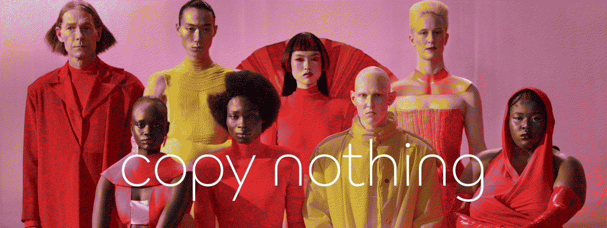
Jaguar’s rebranding is deeply influenced by its founder, Sir William Lyons, and his mantra: “A Jaguar should be a copy of nothing.” Simplified to “Copy Nothing,” this guiding principle is now at the heart of the company’s ethos. It extends to every aspect of the brand’s identity, from marketing phrases like “Create Exuberant” to its minimalist yet dynamic design elements.
Looking Ahead: A Glimpse of Jaguar’s Electric Future
The world will get a first look at Jaguar’s vision for its electric future during Miami Art Week on December 2. The event will showcase a new concept vehicle that embodies the brand’s reimagined ethos and design language. Early teasers suggest the production version of this concept is already undergoing road tests, hinting at a striking blend of luxury and innovation.
Why It Matters
As Jaguar positions itself as an EV-only brand, this rebranding marks a significant departure from its legacy designs while retaining elements that resonate with its rich heritage. The new identity not only sets the stage for its electric vehicles but also redefines how the world perceives the Jaguar brand.
Stay tuned for more as Jaguar drives into its electrified future with bold designs, vibrant colors, and an unwavering commitment to “copy nothing.”

